Showing posts with label color. Show all posts

Tuesday, February 23, 2010

The Many Colors of the 2010 Olympic Games

As we all sit eyes glued to the television watching these amazing athletes compete at an event of a lifetime, you may not realize how the strategic placement of color helps aid in your visual excitement of these 2010 Olympic Games in Vancouver.

It's not mistake that from curling to biathlon, skiing and everything in between the colors above have been prominent. The colors that have been chosen are an interesting twist off the Olympic ring colors, and have been placed in a way to make even the most mundane sports visually stimulating.


As you can see of the athletes above, notice all the vibrant greens and blues in the banners, ice rings, etc., mixed in with the added vibrant uniforms of the countries. With all this combined it creates an energetic backdrop and focal point to make even you at home, visually stimulated and excited. This was by no means a mistake.

So next time your watching the Olympics, remember that some marketing geniuses spent hours on the color selections and placement of color to help aid in the you excitement of watching the games. Happy viewing!

Tuesday, November 17, 2009

Coffee Talk & The Perfect Color


Many of us have this problem, and it's not a bad one, of LOVING coffee! As I'm drinking my cup this morning, it hit me that the color of coffee, I drink mine with way more milk & sugar than coffee, is the perfect color for walls especially in the living room, family room or study!

My color pick is Diverse Beige from Sherwin Williams, as the best color match for the perfect cup of coffee. I've used it in many applications and it's worked like a charm every time. The neutral color suggests a casual elegance that's sophisticated and warm.

If you're a lover of off-white, white and gray paint, than give Diverse Beige from Sherwin Williams a try. It will be a neutral backdrop for your furnature, and it'll be visually interesting.

Good Morning, and happy coffee drinking!

Wednesday, August 26, 2009

Back Entrance Way Floral Mural

I'm now realizing for the second time that every project I do, and every color I use ends up being my favorite. With that being said, lets take a peek at my new favorite mural project of the week.

Every project has an exciting story behind it. The addition/renovation of this house was about 2 years ago, and ever since then, the homeowners have always talked about placing a mural within this space, since the walkway really doesn't allow for pictures to be hung. Well they got their wish about having a mural! The best part, is they have no idea. Lets see how long it'll take them to figure out it's there! I'm not good at surprises, and lets hope they're not following my twitter updates or blog.

Back Entrance Way: Before Mural

Being from Georgia, this house has the look and feel to be found on the pages of Southern Living. I knew that this mural couldn't be just ANYthing, but had to have a sophisticated look and feel, like something you would find in Southern Living.

My inspiration came from hand painted Chinese silk paintings, and kept with muted colors and some hints of saturated color here and there. Taking hints from the way homeowners decorate is a huge key an help when you are deciding how to design your mural. This homeowner likes to use muted wall colors, and accessorize with pops of color, and that's where my color decision came from. I also decided to do this mural in Oil paint.

Back Entrance Way: After Mural

Wednesday, May 20, 2009

May Color of the Month

May's color of the month is, Grandiose From Sherwin Williams.

What a great way to keep spring around with this muted out green. Add accents in creamy whites and olives.


Thursday, October 26, 2006

Leather Faux

Here is a picture of 1/2 of a wall that I fauxed. I wanted to show how you can handle color and texture in an open floor plan. It is a wonderful leather look, which matchs the sofa which is in the sitting room, not show in the picture. I'm always disapointed in how faux finishes photograph. Hopefully you can make out the Faux, it's stunning in person!

Monday, June 26, 2006

HOUSE | Modern Gold: Color Consult

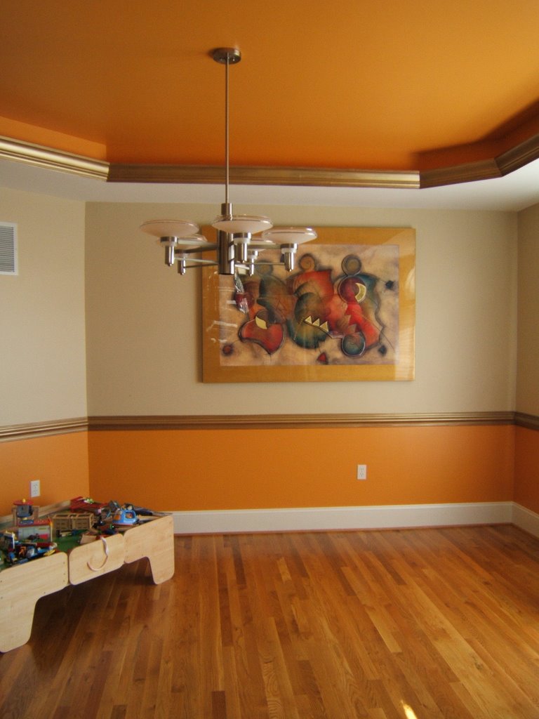
When you have an open floor plan deciding what colors to do can be tricky. In this home we decided to go with a warm color pallete, staying with the golds and yellows. The dining room painting set the mood for the first floor, giving a modern yet classic feel. Adding a splash of bold vibrant color can be intimidating, yet a wonderful conversation piece!